FAQ -- The Why of Our Logo
The Why of Our Logo
We live in a day of brand recognition, where a majority of the people can recognize the Nike swish, but the logo has no meaning. This can be said with many of the most popular logos kids see daily. When we set out to design our logo we wanted one that truly had meaning for our students, their parents, and our staff.
What Our Logo Represents
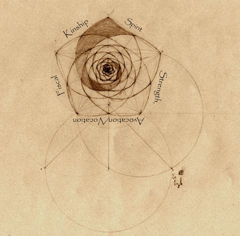
The Ballance of Our Focus
We reversed engineer the most prosperous and happy people over time, particularly the Greatest Generation and their parents. What we found was they had common daily core routines and habits from those five tenets above. Our logo represents the balance of five components or tenets of the happy and successful person as follows:
- Health and Fitness
- Vocational and Avocational
- Kindship
- Fiscal
- Sprit
It is our belief our logo reminds our students of the areas they set goals in and there must be a balance of the goals.
Represents Connections to the Past
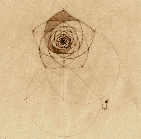
The original drawing was hand-drawn by a typical high school drafting student in the 30s, it represents the skill and attention to detail the Greatest Generation possessed. It was an assignment from a high school drafting text that was later used as a university machine engineering drawing text it shows what the expectations were of that generation. It was drawn with the most basic of drafting instruments; t-square, 30-60 & 45-degree triangles, scale, french curve, wooden pencils sharpened with a knife and sandpaper, pen, and ink well. It was drawn when the only technology in the classroom was the lights. Represents Connection the Technology has with Nature
It was drawn using the golden mean with Fibbinoch numbers throughout. Our logo shows beautifully our balance of technology and nature. It was scaled and rendered with AutoCAD showing that we also see value in our students today’s technology when appropriate.
The Foundation Represents Stability and Balance in the Triads Necessary for Prosperity
The first step in drawing the logo is forming the triangle which is the foundation of the logo. The trigangle the most robust geometric shape which describes stability. In this triangle, each vector has nearly equal values represinging each vector is equally important we use this to represent several different triads. In learning and succeeding in goals, we use the base of the logo to remind the student of the following triads.
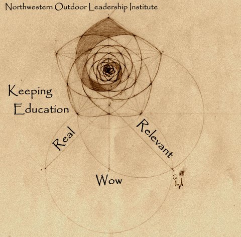
For our staff, the triangle is a reminder that the foundation of what they do with the students must be real, relevant, and wow.
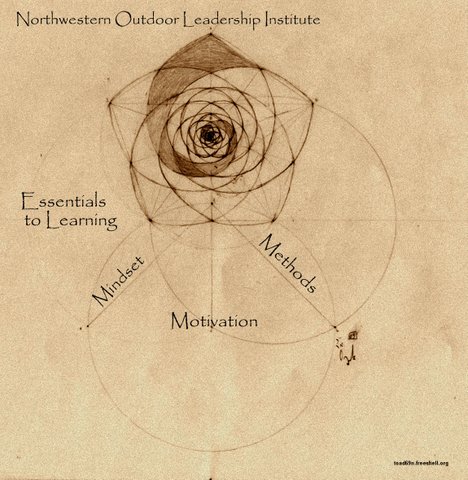
For our students, It is a reminder to them the foundation of their learning they must own it, practice it, and make their best better.
It is also a reminder to the students that their success must be based on their growth a mindset, their “why, and their process.
It is a reminder all that the child’s future success requires work from the parents, staff, and students.